Thick as a Brick: Conceptual Album Covers and Visual Art
- Rockestra - Battle of Evermore
- Jun 2, 2025
- 4 min read

Introduction
Jethro Tull’s Thick as a Brick is often crowned as one of the most ambitious albums in progressive rock history. Released in 1972 as a response to critics misinterpreting the group’s previous album Aqualung (1971) as a concept album, the entire album consists of one 43-minute song (however, due to the time limit of a vinyl side it was split into two parts). Ian Anderson wrote this album to be as satirical and conceptual as possible, making the album cover into a newspaper, “The St. Cleve Chronicle,” full of Anderson’s written articles and ads. Having the newspaper centered around Gerald Bostock, an eight-year-old fictional poet, who wrote the lyrics to “Thick as a Brick,” allowed the band to explore multiple narratives in both lyrics and visuals, hence the final product including themes of societal critique and absurdity.

The Newspaper
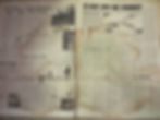
Beyond the music itself, The St. Cleve Chronicle, the fictional newspaper that accompanied Jethro Tull’s Thick as a Brick album, plays a crucial role in the record’s satire. It's main focus is the story of Gerald Bostock, “Little Milton,” an eight-year-old prodigy disqualified from a poetry contest due to the supposed inappropriateness of his work. This absurd story makes fun of the gatekeeping of art and the public’s discomfort with challenging art. The newspaper also delves into the fact that the Jethro Tull band took this same poem as their song’s lyrics. It includes a fake interview with the band that makes fun of their creative process and mocks how some people see progressive rock as overly serious or pretentious. Ian Anderson has commented how he criticized his own work as a response to critiques, who were the “reason” of this concept album coming to life. The interview makes fun of the way rock journalism can be overly analytical or blindly dismissive. Together, these components blur the line between real life and the story presented, expanding the album’s critique of conformity, censorship, and the commercialization of art.

The Album Cover
At first glance, the cover of Thick as a Brick might look like a simple newspaper. The album's creators, including Ian Anderson and photographer, graphic designer Andrew Douglas, however, made a piece of visual and literary art that is as uniquely sarcastic and full of intricacies as the music it accompanies. Ian Anderson held the album cover to the same standard as the music in it. The cover is full of mock newspaper articles, advertisements, and personal ads, which sneakily criticize the superficiality of society. The original vinyl even came with a 12-page foldable newspaper, adding reality to the art. This formatting reflects and essentially makes fun of progressive rock's tendency towards dramatics, theatricality, and conceptual depth.
Artistic Themes
The artistic choices made in the newspaper, including typography and vintage graphic design elements, place it within the ranks of visual art such as surrealism (a 20th-century avant-garde movement in art and literature that sought to release the creative potential of the unconscious mind, for example by the irrational juxtaposition of images) and pop art (art based on modern popular culture and the mass media, especially as a critical or ironic comment on traditional fine art values). Moreover, the text could be interpreted as following art movements like Dadaism (an anti-establishment art movement), with a focus on toppling reality through absurdity. Additionally, the album fits into the broader group of artistically ambitious prog rock album covers. Other bands having these kinds of albums are Yes, Genesis, Pink Floyd, etc.
The visual art of Thick as a Brick is not limited to the cover. The album’s presentation as a literary piece, a “newspaper,” extends into its performance and thematic content. This album cover becomes an essential part in the storytelling music, not only by giving a background information and “folklore” to it but also by inviting listeners to think about the intellectualism behind the rock group and music.
These kinds of covers were meant to be interactive, encouraging listeners to engage not only with the music but also with the conceptual world that the band had created.
Connections Between Album Cover and Lyrics
One of the most interesting aspects of Thick as a Brick, perhaps, is how the album’s cover and lyrics complement each other. The newspaper's design actively informs the reader of the lyrical themes sung in the album. For example, in the newspaper, we can see mentions of a known World War “superhero” Biggles, who also appears in the lyrics of the album in a satirical light. The lyrics are written as follows: “So, where the hell was Biggles when you needed him last Saturday?,” and you can see the mentioned article below. This line is satirical because it disputes childhood fantasies, showing that superheroes don’t actually exist and you have to be able to solve your problems by yourself. The newspaper article about Biggles ties in to this, highlighting that the actor of Biggles, like the hero he portrays, is not noble, but petty and cruel, mentioning how the actor playing him got peed on by a dog during filming, and it’s implied he killed the dog in retaliation.

This serves as a visual and thematic bridge between the two elements of this art piece, demonstrating how the design and music are intertwined. The serious lyrics give depth to the humorous artwork, while the artwork gives a storyline to the lyrics. The newspaper becomes a tool that enhances the listener's understanding of the narrative and themes of Thick as a Brick, such as identity, societal expectations, and deception.
Conclusion
Thick as a Brick is not just a rock album; it is a representation of how art, music, visual design and storytelling can merge to create something great. Through its cover, the newspaper format, and artistic themes, Jethro Tull invited listeners to experience the album not just as a musical journey, but as an immersive work of art. The interplay between its visuals and lyrics elevates the album, creating a lasting piece of progressive rock history that redefined what a conceptual album could be. Satirical in tone, the album critiques progressive rock while embodying its technical brilliance.